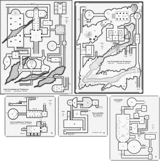
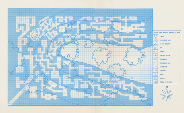
  Whew boy. Out of the simple little B2 complex, into the Great Grandaddy of Dungeons, a husky four-level complex (with generous sublevels) sprawling over complex pages and pages of eye-hurting Judges’ Guild cheap ink. The community term “Jacquaying” comes out of a cargo cult built around these wonderfully interlinked and looping maps, often perhaps not understanding what really makes them good. The original maps are a bit rough to even parse, but even redrawn they’re very complex: Daggum. There’s a lot of ambiguity in the image here. The first thing that screams for attention are those huge tears; structural damage makes everything about the map going forward look weathered, ancient, falling (literally) into ruin. It’s a welcome naturalistic touch for an environment that actually does struggle with appearing somewhat artificial…something about the room layout does give a vague impression of “this is a game first” rather than the flow I would first expect to see in a living architectural space. Lower down, the palace and crypt complex for levels 3-4 are more naturalistic, with the resultant drop in exploration complexity. Most of the difficulty groking the maps comes less from their artistry and more from their design, however…so A- for presentation. Conceptually, what we have here is the ur-dungeon. A winding, echoing environment with most straight stone halls broken up by occasional natural rock features, cleanly separated into “zones” with plenty of cross-connection. There are really two dungeons here, the first that upper pair of fallen halls with all the crevasses, the second the weirdo minotaur palace/trees/undercrypts…both concepts are solid, of course. The incorporation of each section together feels a little artificial (and actually makes me wonder if the author had two different dungeons being combined). B+ for concept, only because of the disjoint really. All of these quibbles rapidly fade away, however, when we get down to the actual pen and paper. Look at the design shown even in the very first room…there are two options presented immediately, but there’s also a blocked third that indicates the complex is big, and yet also fallen. Then you have the obvious draw of #2 as the next spot, but the way that it interacts with the hallway in #6 also tips off the players that they need to be looking for secret doors, setting up for a jaunt to #9 after an otherwise simple little side-loop. It’s actually doing a good job of making a very limited first section that teaches the explorers the methods to Thracia’s madness. And then, we go all over the place. A sloping hallway going down a level…secret passages leading to hidden rooms…more secret passages giving shortcuts…chasms allowing rope-using PCs up and down access…subsections that going up and down and all around…it’s a crazy exercise in exploration and discovering, rewarding careful mappers with geometry juuust symmetrical enough to hint at the unnumerable secret passages. As a pure exercise of just mapping, the upper half of Caverns of Thracia is a delight. Then we go down the elevator to Level 3 and we’re in a whole different module. Bereft of all the interesting atmospheric descriptions, the “outdoor” area is dismayingly simplistic. Wander around a bunch of flora, then assault a pretty “flat” palace that’s rather symmetrical and linear (judging by the standards of what came before), and if you are even so-so at looking at geometry then you’re not having any issue at all in making your way down to the final level. The fourth level is fine as a module adventure section but it’s a lot simpler as a map. One branchy loop, then two more big branches with their own little sub-branches…I’m not mad about it, but there are far fewer choices in exploratory gameplay. After all the early training to look for hidden passages and secret loops, the players are going to find them only rarely, a notable shift for a bunch of explorers hardened in the fires of the first few maps. After the front-loaded brilliance, the later maps are merely…okay. Still, A for execution overall. I wonder if there’s some hidden wisdom here, in the end. As the PCs level up, the initial cautious exploratory gameplay can be dispensed with more often for frontal assaults of plate-wearing supersoldiers backed by high-level magic. As nice as brilliant maps with chasms and crevasses are, those gaping maws are a lot less scary when someone in the party can fall light feathers, or tame flying monsters, or teleport…just as new gameplay opens up with leveling, I think Caverns of Thracia also shows that there are old aspects of gameplay that start to take a back seat as high level demigods stride the lands. Cartographic design principles do in fact need to change as high-level powers come online, shown starkly in this adventure as the “decent into the underworld” leads to maps that are simpler, not more complex. That’s not really a critique, but it is definitely something to keep in mind lest we descend into cargo-cult worship of “The Loops” without seeing that even one of the most influential cartographers in the hobby dispenses with them as the adventurers grow in power and options. 
0 Comments
  A dungeon by Scott Malthouse, level 3
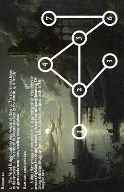
Written for Heartseeker I find myself wondering about the process here for coming up with an adventure’s name. Are we to contemplate a dread bishop’s own ruined remains, or are we instead being called to explore ruins once belonging to this dread bishop? Idle musings, really, but when a four-page product uses half its meager count to detail a mere seven locations outlined in yet another dreaded node map…well, the mind begins to wander. Heartseeker once more, because it was how my Google drive sorted my itch.io downloading spree. I wonder if this, with double the page count, will be a better representative adventure than last time? Basic setup is that the Dre…er, the Veiled Bishop, one Mr. [404 name not found], was once a very greedy fellow who was very bad and took too many tithes while being directly worshipped by his bishopric. If his people didn’t pay cash money he took the difference in souls and anyway now he’s dead but his soul is in a reliquary and it’s all very standard. Gorgeous piece of art being used for the cover image/node diagram background, I don’t recognize the work exactly, but it has a STRONG Hudson River School feel, wonderous and moody. It’s doing a lot of work. Now what I liked isn’t complex, but simple isn’t bad…there’s a move made to attempt a little bit of interaction, with a crazy bird lady wanting her favorite dagger/ogre’s pet goblin whole stole it/clear water where ogre threw the dagger also showing skeletons, that’s a solid triangle right there. I don’t hate the stab at puzzle-encounter design with undead crusaders in the main sanctuary standing on black squares in a checker pattern. Shyly hinted-at alternate means of vanquishing the bishop’s ghost, namely ringing the ancient church bell, is a cool idea with a decent complication of needing to rehang said bell… …but what can be improved is actually allowing any of those good ideas to be implemented. The bell thing? As written, you might have SEVEN undead whaling on the party while they take multiple rounds to do it (also note variable amounts of adds again, grump). That little drama with the dagger? The bird lady attacks by default, the ogre and goblin attack by default, and the skeletons rise to attack by default. There was potentially something decent here, but then you turned it into a boring hackfest. It almost doesn’t need to be said, but I need to say it…GIVE US A REAL MAP. I understand cartography is scary, but the adventure is set in a ruined church, there are millions of church schematics available, so many that even 2023’s Google could find them. Physical geography always improves an adventure. I’m going to regretfully say that the best use case for Ruins of the Dread Bishop is to look up what whoever that artist was for the inspiration artwork and adventure from that instead. The hackfest is okay but nothing new, the few flashes of good content aren’t anything so novel that you’d want to steal them. Maybe the undead-dispersing church bell? But I feel like I’ve seen that before… Final Rating? */***** not with hate or annoyance, just with mild disappointment. 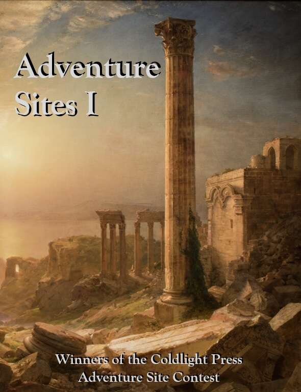 Check it out today. Excited to hear about your own reactions, and above all...PLAY THEM.
  Okay, you knew this one had to be first. Possibly the most-played, and probably the least-completed, dungeon complex in the entire history of the hobby…monster zoo, multi-level, famous and controversial, we have the Caves of Chaos: First of all, let’s talk about the presentation…it’s not great. The original TSR blue photocopy-resistant color can be a little uncomfortable even in a fairly traditional dungeon, but with an environment this complicated and layered, the overall effect is very overwhelming, busy and layered and all over the place. The cave entryways’ interaction with “trees” is less than clear, as are the slope setups. All this is given thought in the module itself, but it is a whiff on the information presentation side. The complex er…complex is perfectly runnable, but it’s a hard to parse from the direct view. “Stairs up” vs. “Stairs down” particularly wins an award for least helpful legend ever. C- for presentation. The design concept, though, is great. A narrow slot valley with multiple openings makes everything seem incredibly open to the approaching party, while also giving the subconscious message that “higher levels = higher level” in a wonderfully literal sense. People who unironically use the word “verisimilitude” will object to the monster zoo aspect of each species being a hundred feet away from the others but looking at the conceptual design of the space itself…great idea. Verticality is important in general, but there’s something particularly nice about being able to hit various bits of the map just by scrambling up the slopes. Really the biggest objection is that they don’t all have back-line interconnection, but that’s not the point of the adventure. A+ for concept. All that being said, in the actual execution…eh. The reason for this adventure’s classic status is more the setup and the room details, rather than the map’s direct flow. Branching little complexes like A or G have very fun encounter potential based on the writing, but in terms of exploration there’s just not a lot to them. The better early complex is south with the goblins managing to link D-E-F, there’s a lot of flow those secret doors allow, with extra props to the whole secret wing of rooms 28-31. B-C is okay. Complex H is particularly annoying in how it staunchly refuses to link to C or G. As a finale goes, the J-K complex doesn’t bug me, I like how J’s link to K is in the most counterintuitive direction, while the final rubble-strewn passage out in the southwest is something that more module designers of today should consider. There overall use of secret doors is interesting to me with the Caves of Chaos. You like loops? Well they’re your reward for bringing along the elf. After you find the first one (probably between E-D), you’re keyed up to look carefully for hidden links between caves, with canny parties probably monitoring what height they’ve ascended or descended to so they can be on the lookout for a secret door leading to another evident cave mouth. I’m mixed in the intermittent reward aspect of the secret doors being only in some locations…I can imagine a clever mapper bashing his head into the wall for multiple torches in room 33 seeking passage to 40, for example. In room 45 that intuition might be rewarded in a surprising way. It’s easy to fetishize looping dungeon designs at the expense of actual play. Just because it’s all on the same page, every single point doesn’t have to link to every other in multiple ways…it’s okay that the caves are actually six dungeons, not a single one. In a very dense, slightly silly way, the module is teaching about how to implement multiple dungeons on a single map, with just enough travel between them to provoke a random encounter check. It’s a miniaturized campaign, which is very cool and why the module’s had so much staying power. Now within those aforementioned six dungeons I am more distressed at the level of linearity. Something with only six keyed rooms like A or G make sense to be branches-not-circles, but there are a lot of branches that suffer in the larger complexes too. I could also do with the verticality mattering more, very often its just a slope or a stair for tactical, not geographic, purposes. While trying not to be overly fastidious, there is more that could have been done with the map(s) to encourage exploratory play. I’d say it was avoided out of a sense of compassion to the player mapping, but complex I exists, so that’s out the window. B- for overall map execution. None of this is me saying that Keep on the Borderland isn’t an awesome module. The Caves of Chaos are well made for the module’s purposes…mostly. Unfortunately, B2 is “often begun, rarely finished” in part because of the disconnected nature of the various cave complexes. Couple that with a restock suggestion that can be a little demoralizing (you cleared the kobolds, yay, now enjoy the same complex but with goblins), and I think it’s evident why the upper caves don’t get explored that often despite the massive number of people starting with those dang kobolds. Some of that is the nature of the game, some of that is because of the module’s massive popularity leading to uncommitted groups, but a little of that does come from the lack of interconnection between upper and lower cave complexes. I’m not going to argue that B2 is anything other than completely successful, but I do wonder if with a little more map interconnection it could have been even better…  Crapshoot Monday: This Free Thing I Found on Itch.io…Melting Skulls of the Conquering Dunes4/8/2024 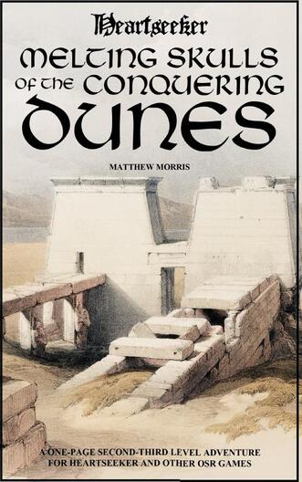 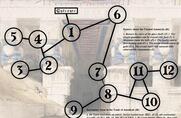 Not lazy at all... Not lazy at all... A dungeon by Mathew Morris, levels 2-3
Written for Heartseeker You thought “any OSR ultralite niche levelless fantasy system” was part of the April Fool’s japery, didn’t you? Naw, here’s something for Heartseeker, which is basically that but with levels. A self-declared one-page dungeon that clearly takes two pages to describe eleven…uh…”locations”, the Melting Skulls of the Conquering Dunes is about retrieving some crystal skulls from a !egyptian tomb in the eponymous Conquering Dunes. A new horrifying trend is herein noted; the map is a very evocative ancient tomb image with an 11-node diagram being called a map. Never change, itch.io…because every time you change, you discover a new terrible innovation. Plot is fine. Patron wants elongated crystal skulls from tomb to melt, tomb map location was bought from a local bedowin [sic], gives cash for retrieval, tomb has revelation that aliens once visited, hidden chamber has crystal skulls with chrome flooring, alien monster summoned as final boss fight after looting. We’re now in 2024, so adventure writers can actually have Indiana Jones PART FOUR as a formative experience, heaven help us. Okay combo of genres, even if the desert is very lightly flavored. What I liked here is the light flavoring stuff…nice to see dead earlier adventurers showing danger nearby, nice to forecast threats with a jackal-headed god statue, and nice to have at least the idea of hidden treasure with a pair of golden keys needed to clear a door found in a side-path. Nice hint about looking down rather than up to encourage basement-wandering. A mild false tomb has a glass skull in a sarcophagus if you want to fool a playerbase made of infants and toddlers. It has its heart in the right place (so tip to those aforementioned seekers). There’s a whole lot of what can be improved on this one. Clearly I’d rather have an actual map, even if it’s scribbled in crayon on a napkin, but even more fundamentally the diagram-map shown is horribly linear…even worse than it looks, actually, because all the branches shown are written to be mandatory. My dearest bugaboo once more rears its ugly head at the entrance, with “d2” guardians blocking the way, make up your mind and give us 1 or 2, adventure. The random encounters are fine in some cases, like a d4 of tomb guardians, but there’s also…a mummy-filled sarcophagus? Randomly encountered? If that thing is literally hopping nosily up and down the hallway I’d love it, but no, it seems like we’re talking about bumbling into a room. Treasure should be given values if the “and other OSR games” part of the booklet’s selling copy is legit. It’d also be nice if a summoned super-advanced alien monster final boss had a little more pizzazz that “claw, claw, regenerate d4 HP per round”. Give him tech, or spells, or at least a diplomatic agenda... Meh, I don’t really have a best use case that comes to mind here. The dungeon is dull, the pieces aren’t compelling, and the premise is a mixture of one of Roland Emmerich’s best movies with one of Steven Spielberg’s worst. I guess I’d use the nice art in the back-map-thing and the front cover. Final rating? */***** sorry, you meant well but this is a linear hack.  I’ll be doing a new series here covering maps; I’m going to start reviewing adventure maps, starting with classics like Keep on the Borderlands and Caves of Thracia, but moving on to newer adventures as well. As a bridge, I think I’m going to talk a little about the Adventure Site Contest maps. Cartography is something I really love about this hobby, and a quality map is what I focus on first in almost any product…but it’s easy to over-focus on it, just like it’s possible to focus on things like art, formatting, or even prose quality over the value of the adventure content itself. The Adventure Site Contest results are a prime example of this. First of all, look at the maps of first and second place…there’s a mostly linear tomb, or a r-r-r-random procedurally generated “branch-style” map with only one loop. That’s completely fine for an adventure site. A map isn’t the be-all, end-all, but rather exists to serve the adventure being played, and in the top two adventure sites the maps were properly scaled and designed for the adventures written. In Lost Vault of Kadish it would have been strange and nonsensical to have looping corridors for a lost king’s vault. In Fountain of Bec, the main treasure room should be off on its own little branch, otherwise the trolls who’ve taken over the dungeon would have smashed and looted it. The top two adventures weren’t really helped by their maps, but neither were they hindered. Other finalist adventures like Glen of Shrikes and Etta Capp’s Cottage were similar, with relatively simple maps that didn’t provide much of an exploratory gameplay experience. That’s fine, they were good adventures. Now I don’t want to minimize the importance of maps either. An adventure like Legacy of the Black Mark didn’t live and die on its very solid map but having multiple directions to explore undeniably helped the adventure it was trying to foster, an exploratory delve. Likewise, Barrow Shrine of Corruption was a very simple and direct site much like Lost Vault or Fountain, but unlike those two its entire flow depended on the main loop, which incorporated a lot of verticality in a vital way. There’s some great atmosphere in both of those entries, but I really think their more complex geography was essential. Probably the two very best maps in the contest did make themselves seen in the other two finalists, of course. The large orphanage/reformatory of St. Durham’s Home for Wayward Youth elevated it masterfully, giving an extremely detailed location with lots of exploration for heist adventures, lots of defensive features for a siege scenario, as well as logical and functional day-to-day flow which is needed for verisimilitude in a site just visited to investigate to negotiate in. Similarly, Lipply’s Tavern as a complex mutli-faction dungeon delve had to have a good map, with verticality, multiple routes of ingress/egress, and secret passages detectable with good mapping. A bad map would have made the site completely fail, while it managed to get up to finalist despite one judge being unable to score it largely because of the quality of the dungeon. So, good map is good. It’s increasingly clear as I go through this exercise that maps are something that must fit the adventure, both in scope and in theme. Starting with a map can be fine, but the map must then be centrally integrated into the themes and scale of the adventure (see half a dozen of my saddest Crapshoot Monday reviews). Starting instead with the concept, plot, or theme and then making a map custom fit to the adventure is probably the best bet…although I recognize that’s a lot more effort to many. Again, the second place adventure site used a random dungeon generator. As an aside, an example of the mismatch situation is Frostfire’s Durance Vile, which had a fantastic set of maps for a module 300% longer. If Stripe does release it as a full module of 8 pages, I’ll snap it up in a heartbeat and the maps are a big reason for that…but maps have to fit. So going forward in this new series, I’m going to be looking at maps, not just as they are by themselves, but also in how they support the module, adventure, Dungeon issue, etc as well. I’m not going to ignore the presentation, because that is an important part of what is first and foremost a method to convey information to the struggling DM…nor will I ignore artistry, because that’s an important part of getting the DM excited about actually running the game. But more than anything else, I want Maps That Work. How do 3-8 buzzed and/or caffeinated players negotiate these things? Because that’s how we put the Dungeons in Dungeons & Dragons. 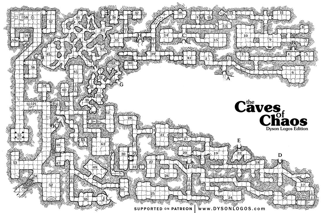 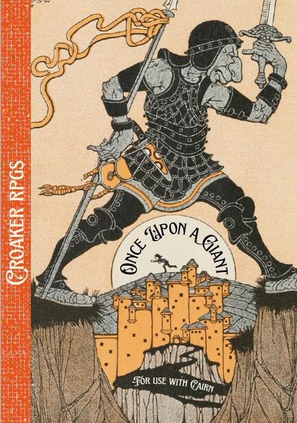 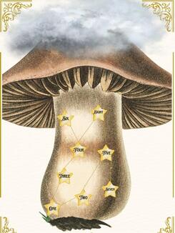 Stunning AND Useful! Stunning AND Useful! An adventure by Thomas Lopez, no levels because...
Written for Cairn Do you like fairy tales, poetry, and whimsy? Do you love abstracted maps, vague physical design, and “but thou must” quest designs? Are you fond of thirteen artistically laborious pages being used for a point-by-point twenty-key railroad? Boy howdy, you know I am! Once Upon a Giant is a clear labor of love and not at all pretentious, a staggering tour-de-force that leaves the reader breathless and applauding from the beginning lavish praise of Yochai Gal and land acknowledgement of the author’s settler homestead to the “…Land Lived Happily Ever After” coda at the end. Let’s dive right into this lush artistic masterpiece! I don’t even know if I should talk about the intricate plot of this work, it is so creative, but to put it only in the most delicate of brush-strokes, this adventure is about a mean giant who has been doing unkind things to the local people but who retreats after his raids to his fortress…which is on top of a giant mushroom! It’s amazing! Naughty players might ask to climb the outside of this mushroom but the adventure wisely declares that’s impossible for anyone but the giant and then provides a helpful rumor about a path through the inside. A fiendish map, elegantly outlain as a node diagram, details how the players are supposed to go up the mushroom and then another details the way through a mushroom forest found on top. That’s right! TWO types of giant fungus. Anyway, then the players go to a town and invade the castle and there’s no maps because those are supposed to be overcome by a friendly bard with a sleep-lute. Man, how can I list what I liked without listing just about everything in this whole module. Is it how the maps shut down annoying explorer-type players by being so abstract and simple? Is it how the town and the castle are both portrayed by beautiful public-domain art with simple labels? Is it how the cloud-bestriding giant, spoken up as the single scourge of the whole region, is also statted to be overcome by lucky players even wisely unblessed by such clumsy ideas as “higher levels”? Well shucks, those are all great but what I probably liked the most was the goblin in the middle of the mushroom named “Fun Gus”…after my sides stopped splitting and I finally climbed back on top of the toilet to keep reading, I was amazed to find that this NPC is a wealth of clues if the players “give him something nice”. The clues are very helpful and not at all either too vague or too explicit! My goodness, it would be insulting to pretend what can be improved is anything other than: MORE! Give us more of this fairytale delight! But certainly not more outlining the giant’s castle that is the focus of the whole adventure, that certainly doesn’t need details like guard rotations, sleep schedules, or entrances/exits. So best use case for Once Upon a Giant is obviously to PLAY IT. Obviously it’s best played in Cairn, but any OSR ultralite niche levelless fantasy system can embrace this module as their own. The author wisely dispenses with any tools, encounters, items, or ideas that would be able to be ripped out of the adventure and used in something else…every bespoke element is perfect where it is. Final Rating? */***** and I hope everyone enjoys the rest of their April. 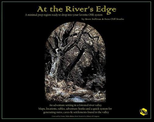 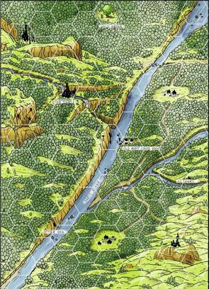 An adventure setting by Brett Sullivan & Fern Cliff Studio, levels unlisted. Written for “your favorite OSR system” The very first thing I noticed about At the River’s Edge was its size. No, not its page count, a modest eight pages. Nor the somewhat odd choice to do it in big A3 landscape pages. No, what staggered me is the fact that the download tipped the scales at a zaftig 142 MB. That’s practically Brobdingnagian. How? Why? Well, I believe the answer lies within its beautiful but completely uncompressed layers, relentlessly working over beautiful maps and dense tables to deliver a bucolic overgrown river valley full of adventure…at least, that’s the plan. This thing is gorgeous. Don’t see a specific artist credited so of course now that means we have to assume AI art, but the maps and evocative illustrations are all very cohesive and genuinely wonderful to see. The region map is colorful and flavorful but also admirably ease to parse…the hex version should be used as an example for how best to map a little region. But. There’s a single line of text on the page with the hexed map, and that’s “1 hex = _____”. There’s no scale given, instead, that’s something you’re supposed to fill in for yourself, no matter how radically different one-mile hexes are vs. six-miles hexes. This is how everything is done…the ruins? Abstracted, roll on tables. The one dungeon, an actually mapped elemental location known as the Ice Cavern? Loot is random from table, encounters are random from a table, source of the magical ice is random (yes, d6 table). Settlements are the same way except for the central hub, a little river trading hub…led by a genderless (you choose) leader who is nefarious or good (roll on table for secret motives). As you can tell, what I liked is basically everything that the author(s) put down firmly. The docks settlement I talked about? It’s well-designed for actually adventuring in, a rarity for TTRPG settlement maps…not only does it have buildings, but it also has secret cellar beneath the inn, with a smuggling passage that leads out to the nearby forest, a watchtower that is designed to be snuck around, an ice house that points to the nearby dungeon, and a political situation rife with opportunities. There’s a potential here for the very highest type of D&D, hexcrawling in the wilderness, I like way some of these tables would shape the campaign. Individual table entries can be very creative too, like the ruin treasures of Ogre tusk(?) daggers, stone tablets to appease the nature faction, giant otter-skin cloak allowing swimming, and a pebble with a sigil that casts a tiny blue light, very fun. The settlement creation tools are nice too, prone to make Places With Problems as you would expect and hope for. I like the regional backstory, too, basically being the site of the centuries-past battle that ended the ogre threat to the Old Empire, now both are withdrawn. Ergo, what can be improved is to give more solidity. I don’t think having settlement generators or ruin generators are a bad idea at all, and I’ll even say these are pretty good ones, but having the settlement half-finished and the ice cavern dungeon half-finished lost a lot in their value. You have beautiful maps and beautiful tables, but in the practical moments while everyone is crunching chips and chugging Mt. Dew while the game goes on…there’s a usability gap. The maps, while pretty, are also very DM-centric and not quite designed to be handouts, maybe the hexmap as a gray area. Basically, expending a little more effort, like two more pages (an extra gigabyte, I know), you could have this as something to run well out the gate as well as having those solid tools. This would also relieve the pressure on those big random tables, allowing the meh entries to get cut in favor of smaller tables with the gold retained. There’s also the issue of the OSR tag with miserable amounts of treasure…this is an easy fix, ye writers, just give more sources of XP. The best use case of this thing is probably to run a sandbox campaign, even with all those above caveats. Homework assignment is a lot more onerous than I’d usually recommend, but there’s the nucleus of a very fun little campaign in this, particularly with a canny user who knows to throw out the chaff rolls and keep the wheat. Stripping out the settlement and ruin generators would also be a lot of value for the theoretical user, quite a high quality for the scope. Final Rating? ****/*****, while not perfect, there’s a heck of a lot here for the discerning DM to use. Great value to be found here. 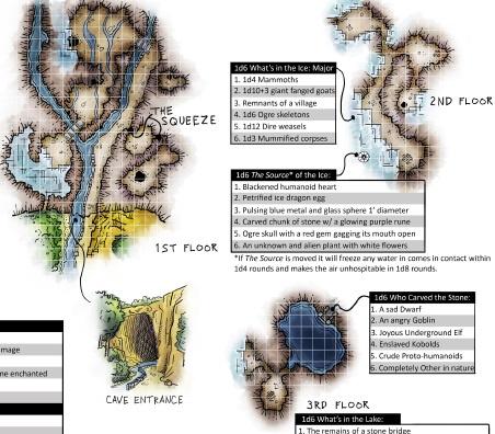 Perfectly showing both the good and the bad. 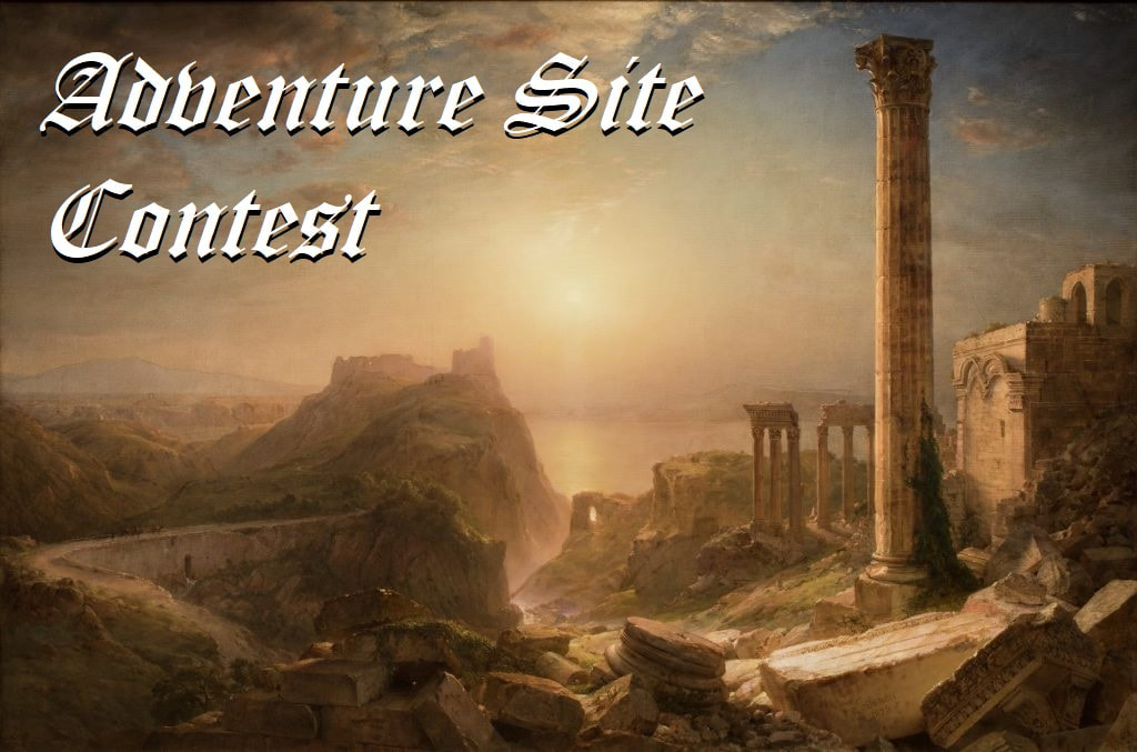 After weeks of reviews and days of intense deliberation, the judges have decided the top eight entries to the Adventure Site Contest, who be all be included in Adventure Sites I. The top two will also receive an adventure of their choice from the Merciless Merchants catalog, and number one is King of the Adventure Sites, and is contractually obligated to so introduce himself at all formal and professional gatherings. To start with, thank you to all who submitted. All the entries had elements we all enjoyed, and I can see using all of them. If the contest has inspired anyone to write more, to release adventure sites on their own to earn tens, nay dozens of dollars, then I hope you do…the first motivation for this contest is to give feedback to writers, and I hope everyone who submits gets a lot out of it. This was a wonderful privilege to judge and run, and I’m excited to see all of you submitting again next time, plus a few dozen more. The last few reviews from Grutzi and Shocktohp are still to come, but both are committed to reviewing all the entries. That said, the 8th to 3rd ranked entries chosen for the honor of inclusion in Adventure Sites I are (in order of receipt): Legacy of the Black Mark, By DangerIsReal The very first entry received, and only a couple points from winning outright, Legacy of the Black Mark is a chilling site that positively oozes with flavor, all laser-focused on making a brutal little dungeon with vast wealth and so, so many ways of dying. A solid map, a wonderful mixture of dangers and boons, a story to be discovered, not told…the bar was set very high indeed with this adventure site as the first submission. St. Durham’s Home for Wayward Youth, By Trent Smith A Greyhawk adventure through and through, St. Durham’s Home for Wayward Youth is an orphanage, a temple, a slaver’s den, and a cult site all at once, eschewing the simple “here’s an evil hole in the ground” formula for a complex site that can be approached on multiple levels, from a direct assault to being used as a simple drop-off-point for the Problem Orc Babies. While the Greyhawk assumptions of the location won’t apply to every campaign, the craftsmanship that went into this site is undeniable, clearly written by one of the game’s greats. Lipply’s Tavern, By Grützi Every judge who submitted an adventure site came in at a known disadvantage; we do not rank (and thus score) our own sites. So when you see Lipply’s Tavern on the list here you should be rightfully impressed, as it means it has one of the highest average rankings by all the rest of us. The wonderful mixture of charm, intrigue, variety, and just pure solid game design shines through even in the teeniest of fonts. If this doesn’t spawn at least half a dozen Hobbit-Hole Crawls in the next six months, I’ll be shocked. Etta Capp’s Cottage, By Scott Marcley Arachnophobia delivered by way of the Brothers Grimm, Etta Capp’s Cottage would sweep first, second, and third place by itself if we were ranking on consistency of fairytale flavor. Personally, I cannot imagine running an Ettercap the same way ever again…of course they’re terrifying storybook spider-widows with houses made of webs. The fairytale tone might clash with some campaigns but for any game with even the slightest toleration for the things of the fey that random encounter roll of “Spiders, Giant” will never be the same again. The Glen of Shrikes, By GiantGoose Without a doubt the most controversial submission on the list, The Glen of Shrikes is an imaginative, creative, and frankly unprecedented submission that is less “site” more “sites”, being a whole darned hex. As it is written I suspect it is frankly impossible to import whole cloth without running in the very specific hexcrawl game (the Ebony Coast). Which, don’t get me wrong, seems like a fun campaign to play in. But just judging in on the internal sub-sites, I can see several that are great to run without their original context. In the end, the creativity and skill displayed got it into the top eight, but if it had been focused on a single site it might have swept into the very top. The Barrow Shrine of Corruption, By Peter McDevitt A quiet, understated entry at first only mentioned for the anatomical map, The Barrow Shrine of Corruption grows ever more impressive upon deeper reading. Very probably the closest to the platonic ideal of the “site for adventure” brief, the site’s very simplicity is itself an achievement; no words are wasted, every encounter, every scene is focused on making a wonderful, memorable adventure in the deep woods. And then it generously has the two open hooks pointing to more adventure sites. …but I know what you want to know. You want to know not just who’s the best, but who are the best of the best, the cream of the cream, the penultimate and the ultimate. Well, those two need to get with me and Malrex for their adventure prizes, because… Runner-Up: The Fountain of Bec, by Stooshie & Stramash A wonderful encapsulation of everything we like about the game, in the Fountain of Bec Stooshie took a random ruin map from online, dumped a randomly-generated dungeon layout underneath, and then did the work to make these simple maps into a living, breathing adventure site full of trolls, double-headed dogs, and an extraplanar octopus. They are traps, there are challenges, there’s an order of battle…and there are treasures, not just monetary but also cleverly hidden magic, a beautifully imagined sword, and the wonderful oft-neglected trope of a saint’s relic. It hits on all marks, and that’s why Fountain of Bec is the only submission that managed to be in the top eight for every single judge. Well done. …and the winner is… Lost Vault of Kadish, by Jonathan Becker Buried beneath the desert sands in a lonely centaur-haunted oasis, the Lost Vault of Kadish just…works. From the well-imagined initial invitation to the underworld with the worn spear-holding statue, to the frantic initial trap/fight at the entrance, to the set-pieces built into every room, I cannot imagine a session in the vault not being a fondly remembered session for all parties involved. Becker in the Vault shows that puzzles, tricks, and traps don’t have to be mundane, while the mostly-linear map has just enough nonlinearity with the difficult bypass route designed as much to trap as to exploit. It’s D&D, of course we should be climbing around in a sandy, gritty tomb doing exactly what the Vault of Kadish wants us to do. Now Jonathan Becker is both legally and morally required to dispense with his B/X Blackrazor online handle to be known forevermore as KING OF THE ADVENTURE SITES. If you would like a crown, I will need your home address to mail you your Burger King coupon of choice. Long live the king. …at least until next year. Once again, thank you to all participants, to the judges, and to everyone who boosted the signal for this site. To the eight writers selected, please let me know any edits/writeups/modifications you will want to make before publication. Watch this space for a final analysis, and the announcement of the release of Adventure Sites I, coming free to an itch/drivethru near you. And thanks for reading…I hope this was a great experience for you, too. Now go play some D&D.  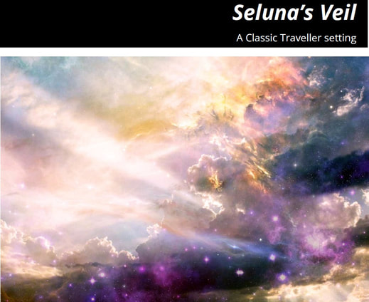 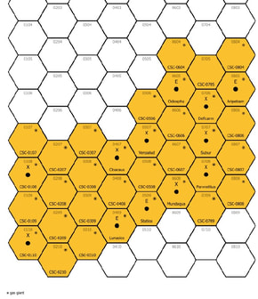 A sandbox by Michael Shorten, levels moot... BECAUSE IT’S WRITTEN FOR CLASSIC TRAVELLER, DUDES And now for something completely different. TRAVELLER? Heck yeah. This thing is an adventure in the classic spacegame sense of being a hexmap with sandbox content scattered around in the hopes of making an adventure out of what results…and then adds a plot pressure by making it a Battlestar Galactica (!) setting. The author is assuming a battlestar-led refugee fleet heading into the eponymous veil, a nebula region that helps them hide from the Cylons. This is actually not a bad idea for a sci-fi space campaign, with not only Battlestar Galactica using that as a plot driver but also great games like Homeworld or Faster Than Light embracing the “explore with a swarm behind us” premise. So, you have a sandbox with a lot of freedom, but also pressure of hostile chase fleets and hungry refugees giving direction and motivation. I won’t hate on it. The module is long, using twenty-five pages to detail the sector with a dozen of the hexes containing systems of interest. Appendixes for fleet crisis rolls, a timeline of threats, and random encounters while setting foot on the planets all add a lot more “adventure” to the sandbox, while the setting-specific stuff is helpful for anyone else using Classic Traveler to play Battlestar Galactica fanfiction campaigns. I think the author’s game is probably a blast. One aside, the author notes that “some” of the content has been generated and then heavily adapted from ChatGPT. He doesn’t outline what, but I’m pretty familiar with how AI likes to generate alien exoplanet biospheres, so I suspect that’s what it was used on. LMMs love speculative and generally boring exobiology, weird huh? Well, what I liked has to be more than just “finally something for Traveler”, right? Well, beyond liking the setting, the premise, and the high-level design, I’m going to laud the ambition here. The module’s size is actually pretty reasonable given that it is a ~6-12 session mini-campaign by itself. There’s a good understanding of how a player-run campaign ebbs and flows, with a good mix of sticks and carrots prompting action. The dice-rolled (ChatGPT) alien worlds are sometimes kind of nifty. The alert reader will notice some of what can be improved from the review so far…give us more specifics, dear module. Proper names are omitted for most of the content, which also encourages some very high abstraction for the random encounters and events. A lot of homework is needed to turn d6=4 and d6=1, “EVENT TYPE: TERRAIN/NATURAL, Terrain is especially (difficult/easy) to navigate at this time” into something resembling actually gameplay. There’s a lot like that, where you can clearly see the potential, but time, ever fleeting, is required to make the game happen. The one mapped feature in the module, a simple Dyson being used as an alien spire, is just five room descriptions…I guess actual encounters are to be rolled? Finally, I have no objection to using language model prompts for seeds, but a there are definitely places where more interconnectivities should have been added between systems. It’s when I examine the best use case that the module stumbles a bit. It’s a great zone for a very specific Battlestar Galactica-inspired campaign, but I don’t know if the region will really pop for the more traditional trade-and-exploration motivated Traveler game. It all hangs together pretty well, but if bits are extracted you start to see how generic it is. Final Rating? **/***** because while it’s a good overview, and the game played can certainly be fun, it’s going to make the user invest so much time that he maybe would rather make something tailored to his game instead. Sad, because a lot of potential was here. 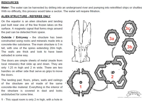 |
