  Going up the D&D tree of life has made me curious about some of the other major systems. Call of Cthulhu isn't a lineage I've ever delved into deeply, but it's popular and pervasive enough that I definitely have a fixed image in my mind: Fedora-wearing investigators smoking heavily, aiming machine guns by gaslight at tentacles of some nameless horror framed just offscreen. That's what pop culture has fed me, but what did Chaosium opt for when they were publishing their very first adventure? In the Shadows of Yog-Sothoth we have an ambitious adventure against a world-encompassing threat. I know nothing about the details of the adventure itself, but given CoC is on its seventh edition...I think it did okay.
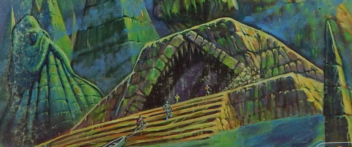
Rather than our city stereotype, this cover takes place in a strange and alien land, greenish and misty. The adventure talks about Yog-Sothoth, but the city emerging out of the water? That's pure Call of Cthulhu (the short story). Although nothing depicted is strictly non-Euclidean, the architecture is strange, inhuman. It's certainly cyclopean in its scale, mountainous in the way even skyscrapers aren't. This looks like a location you're definitely going to have to make a few sanity checks to tackle. It actually took me a little while to notice the humans in this cover image. Reduced to the size of insignificant ants before the gaping maw of the structure's entryway, the slightly different colors they're wearing get washed out in comparison. Although there's no direct monster, there is something monstrous...the slightly phallic/slightly durpy stone octopus statue to the left. It's alien and weird at least, and completely indifferent to the rest of the scene. In fact in general I think the whole cover is about colossal indifference. Nothing in the strange, sickly landscape cares the slightest about the human party investigating it. The party is in danger, not because anything is particularly threatening them with malice, but because they're just exploring a place inimical to their lives entirely. It's a chilling effect, and has done more to make me want to play Call of Cthulhu than hundreds of mobsters shooting tentacles with Uzis. Well done.
0 Comments
 The Professor looks around at the abandoned generators. "I don't suppose any of these would have any usable gasoline still in them, would they?"
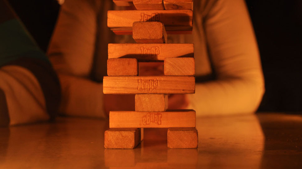
"Well, that remains to be seen." I nod encouragingly to the center of the table, where the increasingly lopsided tower looms. "Are you willing to be thorough in your hasty search?" The Professor's player looks at me warily, then carefully makes the pull. The Professor searches frantically in and among the rusting generators. He smells the faintest whiff of gas, and carefully cracks the tank of the southernmost unit...we all watch the pull. The tower wobbles, shifts...and holds. "I've got something!" the Professor exclaims. "It's not much, but it should be enough for that old jeep for a few more hours!" If you've never had the opportunity to play the Jenga-block-resolution-system Dread, then I'd really recommend it. It bills itself as a horror system, designed for one-shots where some (all?) the player characters really ought to die before the end. Action resolution is simple and ingenious...anytime the outcome of an action is in doubt, when in most systems a die would be rolled, in Dread a block is pulled from a Jenga tower set up in the middle of the table. If the tower falls, not only does the action fail, the character also dies. It's an effective way to build tension during a session, as the danger ratchets up considerably each time something risky is done. It also makes session easy to time, with the host's supply of bourbon the controlling variable beyond player skill. Not a lot of depth to the system beyond that, but it's a fun diversion and it makes me think about the oft-neglected tactile dimensions of TTRPGs. As I've drifted closer to OSR styles of running games the maps and miniatures of Pathfinder's hour-long battles no longer have to be fussed with. Theater of the mind, with just a world map and perhaps a player acting as the mapper in a dungeon, makes for games where enormously more can get done in a single session than the bloated (but very fun) set-piece battles of D&D 3 and its follow-ons. I found the trade-off in terms of crunch and tactics to actually be very mild, with vivid descriptions usually allowing players to set up clever maneuvers without having to fiddle with counting tiles or flanking angles. That said, I think there is something that's lost in the older mode, and that something is the tactile effect of moving minis into danger, the squeak of markers on the battlemat, and the heft and weight of a large "boss" mini hitting the table. More than anything in a strictly game-mechanical sense, what theater of the mind loses is the solid wooden feel of the actual theater, and I think that's a pity. There are a lot of very solid mechanics arguments to be made for TTRPGs eschewing miniatures, but I note that Gary Gygax's group used little soldier guys, and the most classic creative monsters in the original monster manuals came from half-melted cheap plastic toys being used as foes. I think that's something that should be preserved, at least as best it can be. They don't have to be put out on a battlemat, but maybe we should encourage players to have a miniature for their character(s), and certain enemies and friends met should probably have representative pieces too. Give them something solid to handle, and then when the character dies be sure to reach out and knock over the little guy too. The thump and clatter effects of Dread's tower can be brought to D&D games too. I use something similar to the Angry GM's tension pool when I'm building up for random encounters, but I think the single most important part of the mechanic is to use a very clattery ceramic bowl. Hurling a die into a bowl with a loud clang when the players do something reckless wakes up the entire table like nothing else I've ever seen. Fling handouts at them. The old school mechanic of the mapper is great, but I try to go further and let everyone doodle on the map, filling in details, scratching out labels. As best you can, try to make playing D&D something that engages the hands too. Just try not to think about how that makes the sessions more like a LARP... 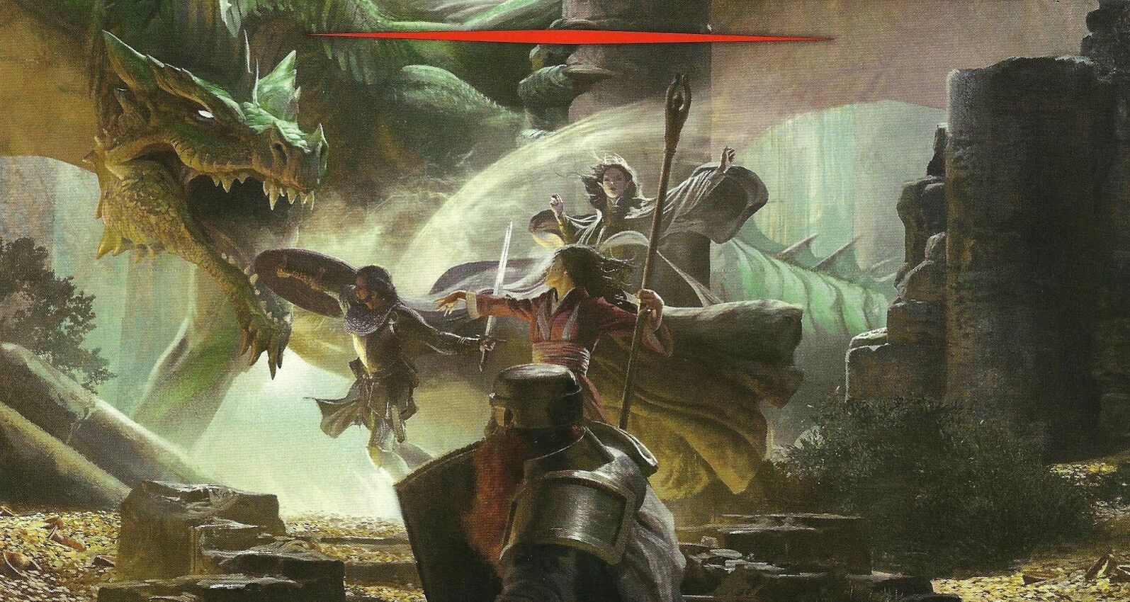 We’ve finally reached the present day, with Dungeons and Dragons’ Fifth Edition. A compromise between 4e, 3e, and the OSR, D&D 5e managed to displease the hardcore fans of every one of those editions...and so of course it is wildly successful with enormous numbers of consumers worldwide. Any criticism levied against the game edition itself or its extremely bland and generic art should acknowledge that the whole thing works as a commercial product beyond the wildest dreams of anything TTRPG that ever came before. That includes the D&D Starter Kit and it’s very generic little adventure Lost Mine of Phandelver. It’s inspired a lot of new people in some very standardized but still very fun directions, so I guess more power to it.
Stylistically, we're now fully into the corporate "brand image management" era. Smooth, slightly blurred, with all the colors muted and no doubt carefully workshopped in committee. The environment isn't a dungeon, but a crumbled ruin is certainly compatible with the D&D oeuvre and I'm giving full points for a most excellent dragon. Billowing robes and the sense of motion in the entire cover illustration certainly have us in the "action is happening" category, which I appreciate seeing. As with Pathfinder before there's no power disparity here between the heroes and the monster. The green dragon is titanic in scale, muscular and vast. It's breathing out a breath weapon, which unfortunately isn't traditional fire but rather poison gas, but at least it looks like something powerful enough to activate the magical protection of its opponents. Corporate carefully balanced the party composition with the most archetypal of parties; human male fighter, human female magician, elf female magician, dwarf fighter (presumably male because WotC isn't woke to female dwarf beards yet). A very enjoyable fight for a balanced party against a monster of appropriate Challenge Rating, fortunately the Bounded Accuracy math of the system will ensure everyone involved has a Corporately Approved Amount of Fun before the heroes succeed. With proper use of Inspiration, only two characters will go down to be revived later in the round. This cover art is perfect for 5e...it's competent, well-built, interesting, smooth, and very flat and generic. I can say it's not to my personal taste but it is objectively to the taste of the majority of customers. There are precisely the correct number of pants. 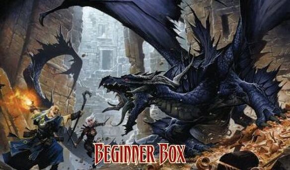 As many of you know, when Wizards of the Coast made the jump to 4E, many if not most of the player base was frankly uninterested in swapping rules. Demand created itself new a supply, in the form of Paizo Publishing's Pathfinder. Beginning as just D&D 3.5 continued, it eventually grew (or metastasized) into it's own giant crunchy weird thing. Full disclosure, I love it, but I will be the first to admit it's a bit unwieldy for some people. Over time, as Pathfinder grew into something that was selling as well as D&D 4e, and Paizo realized if they wanted new people in they should probably try to be a touch more accessible. Thus, the Beginner Box, with simplified rules, handy punch-out miniatures, maps, dice, and a little starter adventure in Blackfang's Lair. That's what's depicted on the box cover.
First, let's give Paizo this. For all that it's been called Dungeons and Dragons, this here is the very first time that an actual DRAGON IS BEING DEPICTED. That's kind of shameful to D&D, considering this game is technically called Pathfinder and doesn't even have the creature in the name. Meanwhile, Paizo is here depicting a dragon in a dungeon, just as we'd hope to see. Great job, guys. The cover illustration setting is overall interesting, a crumbling castle or similar building lit by misty sunlight in the background. The architecture is a little wonky and stylized, the angles more to look cool than actually what I'd expect to see in a real building. The action is taking place in an extremely stylized arena, on the whole...the dragon's hoard of brownish crap looks crumbly, everything is sliding and falling. Videogame again, but this a much more active one. The general style is also spiky in contrast to the unnaturally smooth Keep on the Shadowfell pictures, everyone loaded with bits, bobs, and spikes for days. It makes for a dynamic, if ugly, picture. I don't think there's a power differential between the monster and the player characters depicted. The dragon looks beastial, active, and has some real weight to it, if not intelligence or calculation. Meanwhile, Elf Girl and Shepard Wizard are given equal standing to the dragon in both perspective depth and in power and menace. Damage is about to occur everywhere, but you get the distinct impression that nothing that happens in the next six seconds is going to be lethal for anyone involved here. The promise here is that you're about to have a cool rad fight on even footing in a nifty arena, something that seems pretty in keeping with the hardcore-but-crunchy reality that is Pathfinder. Mystery? Careful environmental exploration? Moral ambiguity? Nothing there. But you can "get gud" with building your awesome fight guys to fight the awesome monsters of your friend the GM, so there's at least something there. Accurate cover. Pants are back, baby.  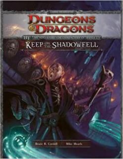 Getting closer to the present now. The team in charge of D&D has decided that there's too much crunch online, too many splatbooks, and too much independent publishing. To nip that in the bud, the wise designers at WotC have decided to release a new Game System License, locking up as much as they can with the shiny new edition's content behind ironclad controls. Inspiringly, the community all comes together and decides as one that they won't support this greedy corporate grab...
...oh wait, I'm getting an update. Apparently, nobody outside of a few publishing insiders really cares about the GSL, the real reason old fans are mad is that WotC took a really slick Diablo-like tactical fighting game and decided to slap the name Dungeons and Dragons on it. Huh, turns out it really is all about content. Even a slightly fuller version of Descent: Journeys in the Dark needs an adventure, though, so timed with the release of 4th Edition we have the edgily-named Keep on the Shadowfell as our intro adventure. The name is inspired by Keep on the Borderlands but Gygax's classic is hard to find here. At least it's trying to be an adventure still; in the next year places like Dungeon will stop even bothering and just publish slick battlemaps with neat tactical situations. For now, though, we have a high-gloss new cover to match a high-gloss new edition. It's certainly a new cover. My memory fades...was teal-and-orange a known meme back in the end of the aughts? We're still in muted palettes but it's now much more digital-looking and the orange of the fires and the teal of the spirit(?) magic really pops. I will say, for the first time since X1, we're finally once more grounded(ish) in a physical space, albeit a slightly noneuclidian one. There's an environment here that is stealing cues from Jackson's Return of the King leaving/entering Mordor. Boy, that was a great scene wasn't it? Sadly, this is just a reminder, everything looks menacing but very unreal. Like in 2nd Edition, we don't have player characters here, rather a villain. While Night Below looked like a movie poster, here in Shadowfell it feels like we're more in a video game cutscene. The guy front and center has some kind of magical power with his Ghost Dangle, looking very edgy and goth and all but his expression is more annoyed pique than real menace. All the skulls, but on his chest and on the faceless guards' shields, look soft, round, and kind of cute. It's the World of Warcraft aesthetic, without that game's refreshing bright colors. Or creative art direction. Or charm. Or personality. I suppose this is definitely a boss to battle, which is what 4th Edition is all about, so we have that accuracy to the cover's credit. Despite my comments, I don't actually hate tactical board games...this just doesn't look like what I think of for D&D. We've lost pants again. 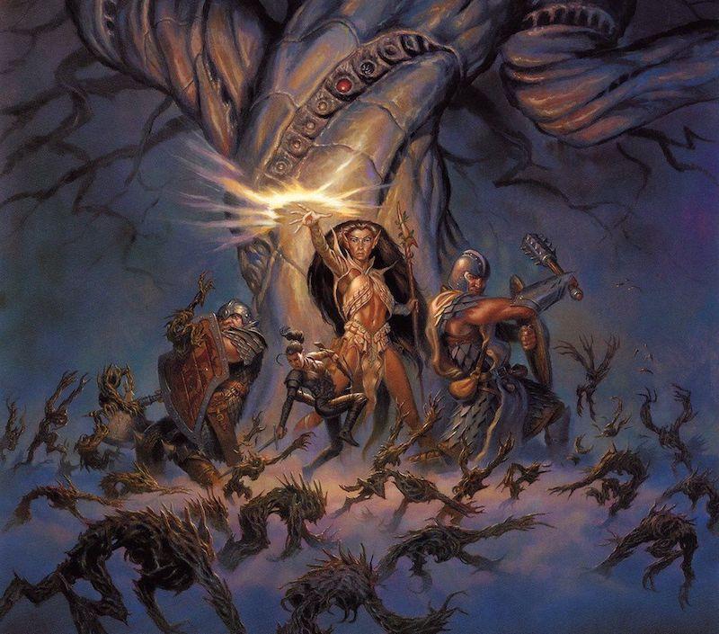 It's the year 2000. We've entered a bold new era for D&D. TSR is gone, now the brand is under the wise and compassionate stewardship of Wizards of the Coast, and there definitely won't be a CEO named Williams who ruins the brand by misunderstanding the customers ever again. A new team has made Dungeons and Dragons Third Edition, and timed with the release of the rules there's a brand new 1st-level adventure, The Sunless Citadel. And boy howdy do we have a tone shift in this cover illustration. It's a whole new world...
First, the palette and style. Muted "realistic" colors; this is teal and orange put through several grit filters. While not photorealistic, there's a real attempt to ground the art in realism, leading to some weird results like the halfling (?) being just an anatomically normal human. It's 2000 so grunge aesthetics are still popular, but there's a admirable restraint with spikes compared to the excess we know is soon coming. The lighting here is stark, we're still in a foggy space but with that tree there's at least a suggestion that the action is taking place in an actual location. And unlike Night Below, we're at least back into the action. The inversion of power from the earlier D&D eras is stark. Gone are the small adventurers, placed in the foreground against massive monsters. Instead, we have a swarm of tiny, spiky, literally faceless monsters, attacking in a mass wave but only threatening because there's a ton of them. The adventurers, meanwhile, are enormous when contrasted with the monsters, even the halfling. While these player characters are all obviously stressed by the swarm of spiky critters, none of them are taking any obvious injuries, a stark contrast to the 1e era where adventurers felt very fragile in the art. These adventurers are heroes, and very powerful:
With the new millennium, cover art have finally granted its protagonists pants. |
